This is Do.List v3.5
The highlights:
- New look
- More powerful quick menu
- New daily notification
- Ability to turn more stuff on/off
Functional-Minimalist
Other to-do apps are either too complicated or too minimalist. Many apps add tiny buttons everywhere. What each button does, who knows! Other apps go ultra-minimalist and, with everything hidden, you can't figure out how to do anything!
So here's the new Do.List design, pretty simple:
Do.List has always been what I think of as functional-minimalist. A clean interface elevates the tasks, keeping focus on the list. At the same time, functionality is never more than a tap away.
As iPhones get larger, some of Do.List's heavy design styles felt extra big and heavy. So, in Settings, you can now turn on "minimalist" to get an even cleaner and more minimalist feel. Check out the old (left) versus the new, optional minimalist (right):
Both new designs should reinforce the core philosophy behind Do.List: Focus on your list and tasks and you'll get more done.
A New Way To Merge Lists
To merge Today into Later or merge Tomorrow into Today, you used to have to use the daily alert, which you'd only get once a day. Now, tapping the three menu dots (in the top right) shows an expanded menu. One more tap and you can merge a whole list. It comes with four options:
- Merge Today --> Tomorrow
- Merge Today --> Later
- Merge Tomorrow --> Today
- Merge Daily --> Today
Here's what it looks like:
A New Groceries Shortcut
Groceries are a part of life for most of us. For that reason, tons of people use the Life List called "Groceries". The problem was, for a list that's often used daily, it took too many taps to get to it! Now, if you're someone who adds to or uses their Grocery List everyday, turn on the shortcut!
You can find the toggle in Settings. Once added, a quick tap on the shortcut will bring you right to your Grocery List!
Note: It's now also easier to input the store and section, if you like organizing and sorting your list!
A New Daily Notification
I cannot overemphasize the importance of looking at your list everyday. A list, like any other space, requires lots of house-keeping. Tasks need to be modified, moved, deleted, and completed. You need to constantly reprioritize as time passes.
To help Do.List users open their app everyday and keep their list up-to-date, I've added a new notification type. You can find it at the very top of Settings, under notifications look for "Daily Use-App".
Word Capitalization Toggle
For those who have been really agitated by the word-capitalization for task names, you can now turn it off! I still prefer the prominence that capitalization gives a task, emphasizing the importance of each to do. However, if you disagree, you can now turn it off!
Find it under Settings > More Settings > Capitalize Task Names
New Life List Designs!
The Daily List has undergone more changes than any other list.
It's taken a long time to find something that's easy to use and not ugly. This is it:
Quotes is another example of a list that's changed quite a lot but, in my opinion, looks a bit better every time:
While the Daily List design improvements are important because every task has four buttons and several statistics and the simpler it is, the easier it is to use. With the Quotes list, however, the design is about capturing words that matter to you in a design that lets emboldens the words so that you want to revisit them time and time again:
So those are just a few of the design changes you'll find in the latest update. I hope you find that they make Do.List easier and more enjoyable to use.
Keep in Touch!
Want another customization toggle added, tell me what for! Dislike the new design, send some constructive feedback! Dave@yourdolist.com
Welcome to Do.List v3.4
After tons of user feedback and hard work, a big update is rolling out! Thanks to everyone who sent in their suggestions and even complaints! I hope you enjoy this version much more than the last.
Twice As Reliable
Do.List has been incredibly reliable, but it just got better. In addition to a saving your lists on the phone, you can tap a backup button to save a copy to your iCloud account. Accidentally delete the app? Just download it again and hit restore. No subscription, no extra cost.
Save Images!
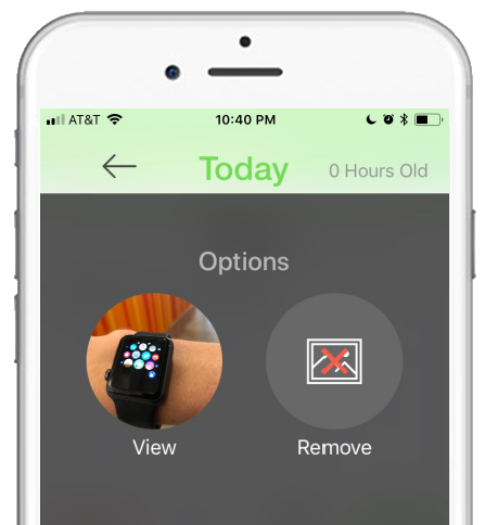
Every task can now have an image attached to it! You can grab a photo from your library or snap a new picture using your camera. Tap a task and you'll see the image icon in the top left corner.
Daily Gets Better
The new Daily List is a big step forward. The new design allows you to quickly read both the times done and when it was last done. Most importantly, you can now send a copy of the task to the Today list.
The Daily list is an important part of Do.List and it will continue to be a point of focus that I work to improve. I appreciate everyone's feedback on it so far!
A Better Editor
Since Do.List launched, the editor has been key. It's always been straight forward and easy to use. The goal has been to keep it simple and the new version does exactly that. The design is cleaner and less cluttered, yet it adds a new ability, attaching images!
Now On Apple Watch
The first Apple Watch app is admittedly simple, but it's also quite handy. It lets you view your Today and Tomorrow list right on your wrist. You can even complete tasks from the watch and it will update on the phone immediately.
If you have an Apple Watch, please try the Do.List app out and let me know what features should be next: dave@yourdolist.com
Grocery List Sections
You can keep it simple and have one big grocery list, but now you don't HAVE to. Add a store and section to tasks and you'll be able to tap the sort button to sort by store or section!
Drag and Drop
Below you may notice a new Later List design, it's a bit cleaner. The big new feature, though, is the drag and drop. The big cells were too hard to drag up and down long lists. Now holding cell condenses them all, then you grab a smaller cell to rearrange it.
Create Custom Lists
Before you could create your own list, but it was only a "regular list". Now you can create checklists, favoriting lists, and more!
To make it even easier, just choose the existing list you want yours to act like and it will use the same exact style.
Rearrange Life Lists
I'll admit it, the old way of rearranging Life Lists was tedious. However, to make up for it, the new way is as simple as it gets. Hold a task now and the app asks if you want to rename the list or rearrange it. Choose rearrange, then hold and drag, let go, and then to save click "Done Editing" when you're happy with the order.
Move to Life Lists
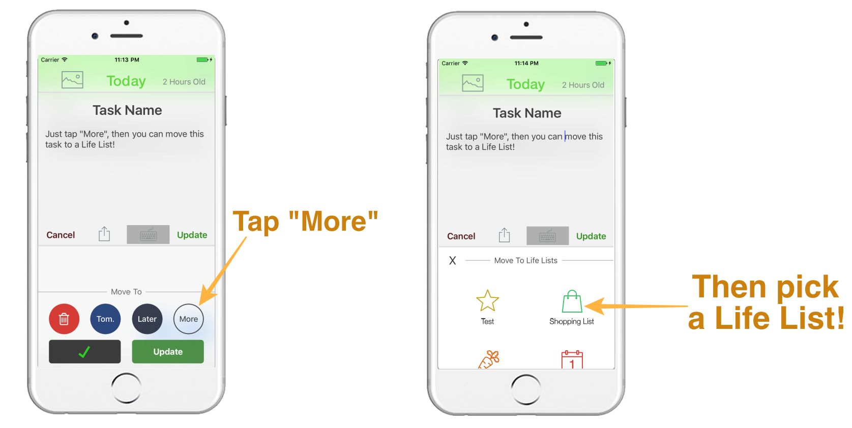
Ever have a task in "Today" that you'd like to move to a Life List? Maybe moving a book from Today to "Books to Reads" or an item from Tomorrow to "Shopping List"? Now you can move them in just a few taps.
That's version 3.4!
Those are the major updates that you'll get with the v3.4 update. Hopefully you find some of them helpful in tackling your tasks.
As always, I'm happy to hear from you if you have suggestions, questions, or complaints. I usually respond in one to three days.


